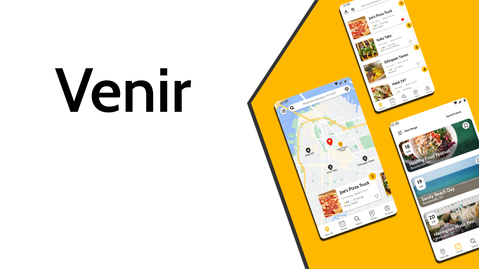
Food truck discovery app designed to make food trucks more accessible.
Introduction
Food trucks operate similarly to traditional brick-and-mortar restaurants, but have distinct characteristics that set them apart. They are mobile, provide fast takeout meals, and often feature niche cuisine. Customers that specifically seek food trucks for these unique values need a better way to discover and use them.
This project started with this simple idea of providing a more comprehensive app that helps customers locate food trucks and order ahead of time.

Research
Initial research was done by conducting user interviews to first understand the user needs and pain points. I prepared a script to direct the conversation with participants, but the interview was done flexibly to allow participants to freely share their thoughts. I paid careful attention to both verbal and nonverbal cues in the interview to empathize with users and gather attitudinal data.
Interview Goals:
Identify inconveniences users face at food trucks
Understand the appeal of food trucks for users
Learn about user experiences with existing apps/websites in finding food trucks
Target Participants:
Adults of ages 20-30
Residing in metropolitan area
Currently employed full-time
Interview Method:
Virtual one-on-one meeting
Moderated interview
From the interview, I was able to identify three key pain points users faced when interacting with food trucks

Persona
The user interview revealed two major kinds of user group related to food trucks. To best illustrate these kinds of users, I created two personas- Deana and Charles. Deana is a more explorational kind of eater who visits food trucks as a form of entertaining activity, whereas Charles is a more pragmatic eater who visits food trucks purely for convenience.
The user journey map visualizes the process Deana and Charles go through to accomplish their goals.


Interview questions script


Competitive Analysis
In UX Design, competitive analysis is crucial part of the research process to understand how the design solutions used by other products perform with users. In this project, I identified five competitors and conducted a thorough qualitative analysis of how their products feel to a user. Each competitor was ranked on their first impressions, UX, visual design, and content from on a qualitative scale and outlined with strengths and weaknesses.

Click on image to view full Competitive Analysis report.
Design
User Flow
The user flow visualizes the paths a user might take to accomplish a goal. This particular user flow helped identify important frames that needed to be created in wireframes.
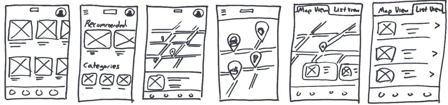
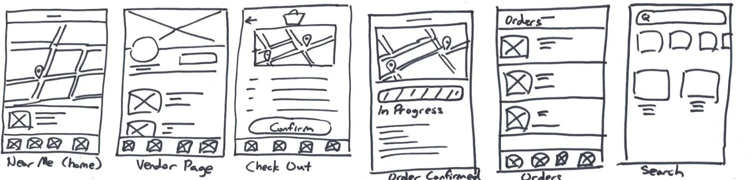
Paper Wireframe
Paper wireframes were drafted with the goal of satisfying our users’ need to easily locate nearby food trucks. The home screen was set as a map view of nearby trucks so users can browse them easily. The checkout and confirmation process were made with the same idea in mind by including a map pinned with user’s location and truck’s location.
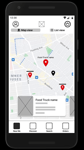
Digital Low-Fidelity Prototype
Using Figma, paper wireframes were transferred to digital form, and further developed to create a low fidelity prototype. Each frame was connected to one another by adding interactions between them. As a Lo-Fi prototype, it lacked visual development and feature realizations but it served as a starting point for this project.


Refining the Design
Lo-Fi Usability Test
To test the low-fidelity (lo-fi) prototype, I conducted an online usability test. Participants were provided with an interactable digital lo-fi prototype, and asked to complete several tasks while screen sharing. Key indicators collected during this study were: time on task and observation.
Click on “Food Truck App Usability Study” image to view full report.
Some of the key insights from the study are the following:

Addressing Needs of Users


Designing tens of frames for a mobile app would be meaningless if it fails to meet the needs of target users in the first place. I made sure to include features that address the needs of personas identified at the initial phase of this project.
For example, for users like Charles, who value time while picking up orders, they can benefit from the pickup time confirmation after placing an order, and the map directions to the food truck to help them get there successfully.
For users like Deana, who like to plan ahead and discover new food trucks, they can benefit from the opening hours and location calendar. The Vendor Information page contains this calendar and other information such as contact info and updates from the food truck owners. These users will also find the Events page useful, as it contains information on upcoming events that will feature food trucks.


Design Leveled Up
Based on the usability study results and general feedback on the Lo-Fi prototype, updates were made to take another step forward in the design process.
Click on the “Design Updates” image to see full report.
Accessibility Considerations
Mockups

High-Fidelity Prototype

While updating the design, I kept accessibility in mind. For visually impaired, ranging from color blindness, poor eyesight, to blindness, focus was put on keeping color contrast up to par with the WCAG 2.0 AA compliance for accessible visibility. For users that may be unfamiliar with technology, focus was set on keeping icons labeled to help them understand the purpose of each icon.


Final Takeaways
Final Usability Test
With the Hi-Fi prototype completed, another round of usability test was conducted to identify shortcomings. In general, participants reacted positively to the updates that have been made since the first iteration of Venir. But there were still many features lacking and designs unpolished.

Lessons learned
While designing Venir, I learned that user feedbacks vary widely amongst participants. While some users had no difficulty interacting with features, others did not find it so easy. I had to pay special attention to the body language and tone of users to identify which specific part of the design gave them difficulty. Another challenge was taking all the data and condensing them into few actionable changes. It was not reasonable to make all the changes feedbacks asked for, so prioritizing design updates was a necessary step to keep the project in motion.