All-in-one solution for better kitchen management
Mobile app project for better kitchen management
How can we improve kitchen efficiency? This question rose from several pain points that occur when shopping for groceries and planning meals. Friddge aims to provide users with a comprehensive way to view and organize their kitchen pantry and fridge to help them remember and plan ahead for their trips to the grocery stores. It also aims to provide users with recipes and tailored recommendations to utilize ingredients at home to reduce waste.
DURATION
2 months
ROLE
Project Lead, UX Designer, UX Researcher
TOOLS
Figma
User Research
“When you are missing ingredients, how do you deal with it?”
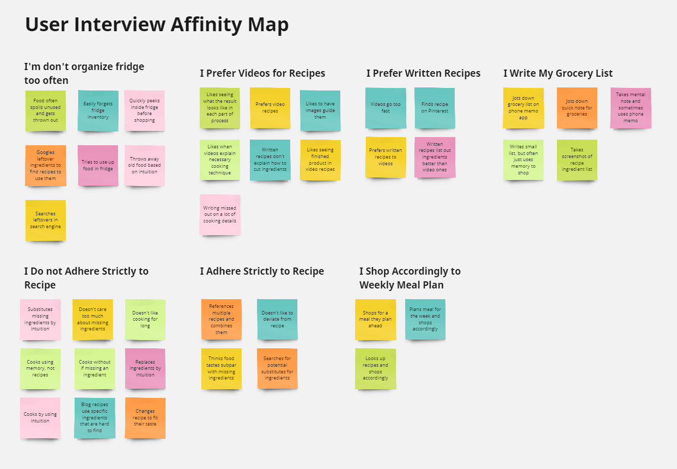
In addition, the interviews provided insights that helped debunk assumptions and biases that could derail the project from properly addressing the needs of many users. The following are some of the findings:
Some users share kitchen space with family or roommates
Some users throw away their receipts immediately
Users often lack culinary tools listed on recipes
Not all users like to strictly adhere to the recipe
Creating a Persona
By consolidating the interview results, I was able to formulate a persona to represent the target audience. Nina here is a working adult who has difficulty efficiently using her kitchen to cook at home. Her needs and frustrations leads to the problem statement for this project:
Users need on-hand information on necessary ingredients so that they remember to buy them at store.


User journey flow chart portrays the high-level view of Nina’s process
Competitive Analysis
As a next step, a competitive analysis was done to understand how existing products tackle this issue. I identified three major competitors to this project, and listed their individual strengths and weaknesses.

Kitchenpal
Strengths
Community-driven barcode item upload system
Can easily select “low” “half” “full” to update fridge contents
Dietary preferences & restrictions settings in profile
Weaknesses
Recipes load slowly
Too many icons in recipe page
No images in recipe instructions

Food Network Kitchen
Strengths
Expansive recipe list
Cook mode puts user presents instructions in focused screen
Meal planner
Video instructions
Weaknesses
Shopping list is very barebones and simple

allrecipes
Strengths
Searching by a long catalogue of ingredients
Offers many kitchen tips
Variety of ways to sort recipes- by holiday, cuisine, and ingredients
Weaknesses
No mobile, only web.
No interaction with your fridge
Feature Prioritization
Using an impact-effort matrix, I organized the candidate features by their effort necessary and their impact on users. This step was necessary to determine which features needed to be focused on first as I started to enter the design phase.

To first understand and define the scope of this project, a user interview was conducted to gather qualitative data. The target audience for this project was adults that cook in a kitchen.
8 adults of varying ages between 25-60 were interviewed in person, and the responses from the interview were organized into an affinity map.
Designing
Paper Wireframes


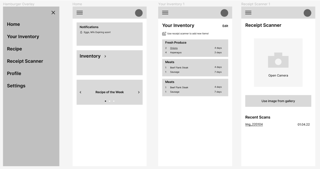
Digital Wireframes

Usability Study
To understand if this early design was appropriately addressing user needs, a usability test was conducted. Five participants of ages 25-55 were approached for a moderated in-person test. Quantitative metrics of task success and time on task were collected. In addition, qualitative data were collected by carefully noting the participants body language, tone, and anecdote.
The following quotes highlights some of the key takeaways from this first usability study:

“It wasn’t very obvious I could click on items in list.”
Added receipt scanner short in home screen
“Item list could get really long if I had lots of ingredients.”
“It felt strange seeing receipt scanner in Inventory page.”
“Home screen feels strangely empty.”
“What if the receipt is too long for one scan?”
Based on the usability test findings, updates were made to the low-fidelity wireframes.

Changed inventory to accordion menu and added numbers to show number of items in each tab
Implementing Style Guide
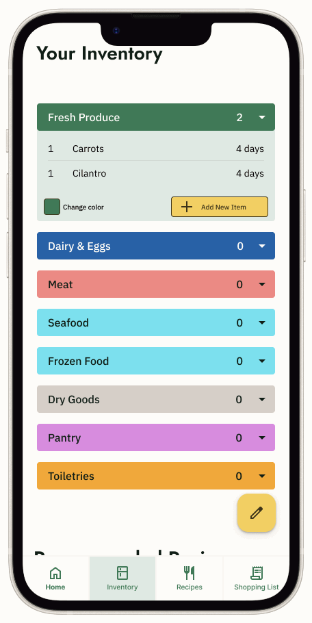
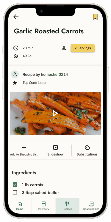
Next, the black-and-white low-fidelity (Lo-Fi) prototype was elevated to high-fidelity (Hi-Fi) by implementing a style guide.

Hi-Fi Prototype
By incorporating the style guide and making updates based on results from the usability study, the lo-fi prototype was elevated to a more complete version.
The following updates were made in this iteration:
Added shortcuts to Home page
Added personalization
Color coded food category accordion menu
Additional category edit features
Added recipe recommendations


Another Round of Updates
Another round of usability study led to the realization that this new hi-fi prototype still fell short to appropriately meeting user needs.
Some new features, such as the accordion menu and editing in Inventory page turned out to actually confuse the users more and increase their task completion time.
In the home page, which was designed to serve as the landing page and access point for other features, users were found to spend less than 15 seconds. Users then expressed frustration that they had to make extra touches to access other pages whenever opening the app.


With these feedback in mind, the following changes were made:
Inventory:
Removed Home page, and set Inventory as the landing page
Cleaned up UI
Clearer signifiers and interaction methods to access edit options
Recipes:
Search feature now shows recents at top and ingredient searching
Changed recipe categories by cuisine
Receipt Scanner:
Scanner shortcut button moved to top-right of Inventory page
Added spell check feature to expediate registering items
Clearer UI and interactions for editing scanned items
Receipt Scanner now takes multiple photos
The Minimum Viable Product (MVP)


Conclusion
Friddge was an incredible learning experience, starting with the underlying user research to define the scope of this project, then designing the product with research and feedback. The biggest takeaway from this particular project was how to iterate multiple times. Starting from the lo-fi prototype, Friddge underwent numerous iterations based on usability studies and peer feedback.